- Box model
-
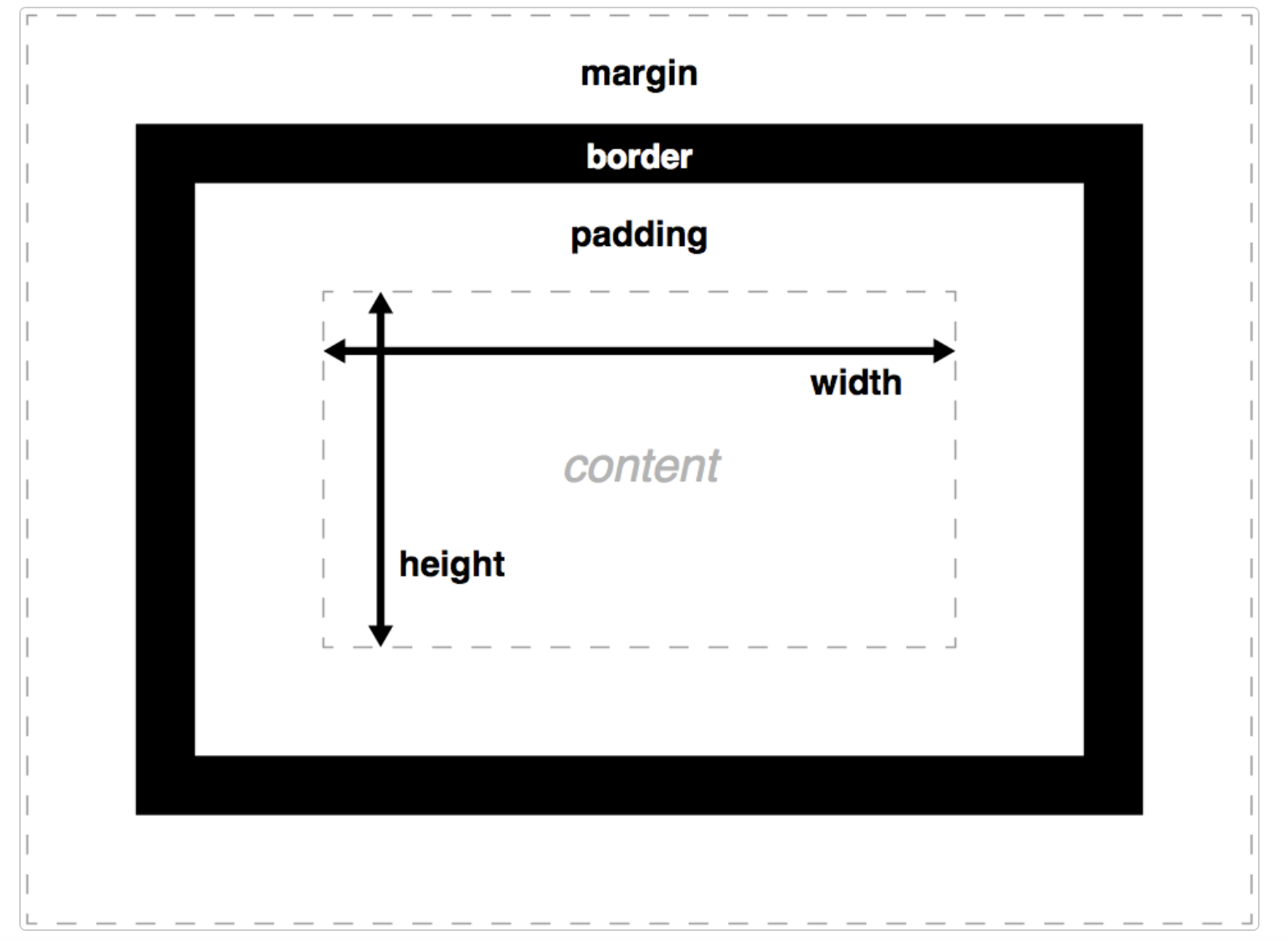
Every element in web design is a retangular box (CSS Tricks)
DONT ADD ANYTHING HERE!
Standard Box Model (MDN Diagram)

Size of Box
-
size-
width
width + padding-left + padding-right + border-left + border-right -
height
height + padding-top + padding-bottom + border-top + border-bottom
-
Parts of Box
Content box- The area where your content is displayed
-
Size it using properties like
inline-sizeandblock-sizeorwidthandheight
-
Padding box-
The
paddingsits around the content aswhite space -
Size it using
paddingand related properties
-
The
-
Border box-
The
border boxwraps the content and any padding; size it using border and related properties
-
The
-
Margin box- The
marginis the outermost layer, wrapping thecontent,padding, and border as whitespace between this box and other elements - Size it using
marginand related properties
- The
Block and inline boxes
Boxes have an
inner display type and an outer display type
Outer Display of Block
If a box has an outer display type ofblock then:
- The box will break onto a new line
-
The
widthandheightproperties are respected -
Padding,marginandborderwill cause other elements to be pushed away from the box -
If
widthis not specified, the box will extend in the inline direction to fill the space available in its container - In most cases, the box will become as wide as its container, filling up 100% of the space available
-
Some HTML elements, such as
h1andp, use block as their outer display type by default
Outer Display of Inline
If a box has an outer display type ofinline, then:
- The box will not break onto a new line
-
The
widthandheightproperties will not apply -
Topandbottompadding,margins, andborderswill apply but will not cause other inline boxes to move away from the box -
Leftandrightpadding,margins, andborderswill apply and will cause other inline boxes to move away from the box -
Some HTML elements, such as
a,span,emandstronguse inline as their outer display type by default
Inner Display type
- Boxes also have an inner display type, which dictates how elements inside that box are laid out
- Block and inline layout is the default way things behave on the web
- By default and without any other instruction, the elements inside a box are also laid out in normal flow and behave as block or inline boxes
-
You can change the inner display type for example by setting
display: flex; -
The element will still use the outer display type
blockbut this changes the inner display type toflex -
Any direct children of this box will become
flex itemsand behave according to the Flexbox specification
Inline-size and Block-size
Inline size
-
The
inline-sizeCSS property defines the horizontal or vertical size of an element's block, depending on its writing mode - It corresponds to either the width or the height property, depending on the value of writing-mode
-
-
If the writing mode is vertically oriented, the value of
inline-sizerelates to the height of the element; -
If the writing mode is horizontally oriented, the value of
inline-sizerelates to the width of the element;
-
If the writing mode is vertically oriented, the value of