-
Best viewed on laptop in Responsive Design Mode
-
⌃ ⌘ Ron Mac/Safari -
⌥ ⌘ Ron Mac/Firefox
-
- Breakpoints are at
850pxand550px-
At
850pxand above, the image with awidthof640pxis shown -
At
550pxand above, the image with awidthof480pxis shown -
Below
550px, the image with awidthof320pxis shown
-
At

DONT ADD ANYTHING HERE!
Example
HTML
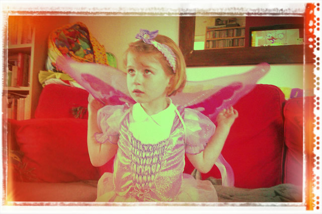
<img

    srcset="../images/elva-fairy-marked-320w.jpg 320w,
            ../images/elva-fairy-marked-480w.jpg 480w,
            ../images/elva-fairy-marked-640w.jpg 640w",

    sizes=" (min-width: 850px) 640px,
            (min-width: 550px) 480px,
            320px",

    src="../images/elva-fairy-640w.jpg"

    alt="Picture of Elva">